
 For general information on how to use the plot controls, see here.
This plot shows the expected total capital expenditure over time for building, IT, fixtures and fittings and motor vehicles. There are three different dropdowns on this page which are explained below:
Units dropdown
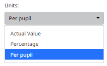
Actual value, which is the capital expenditure calculated from survey question 44. Capital Expenditure.
Percentage, calculated as the capital expenditure divided by total capital expenditure for each year.
Per pupil, which is the capital expenditure divided by the number of pupils. The total number of pupils is calculated from survey question 13. Number of pupils by boarding type as at 31 August.
Quantiles dropdown
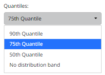
You have the option to display different quantile bands on the chat or none at all. A quantile is a value that divides a dataset into different parts, helping you understand how data is distributed.
As an example, the 75% quantile is the point in the dataset where 75% of the benchmark data falls below that point and 25% is above it.
Benchmark statistic dropdown
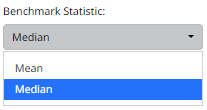
You have the option to display the benchmark mean or benchmark median for the capital expenditure.