Tip
 For general information on how to use the plot controls, see here.
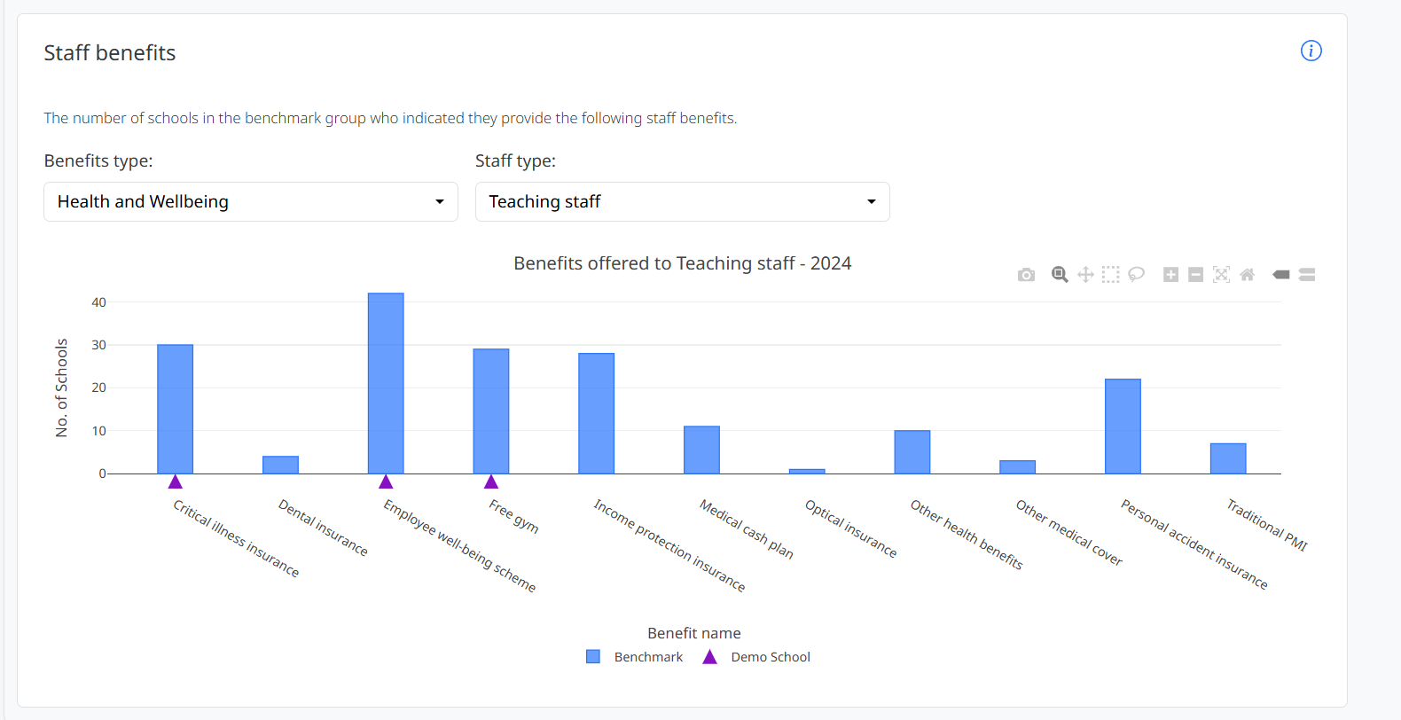
This plot shows the number of schools offering each benefit to the selected type of staff, taken from survey question H-01. You can use the Benefits type and Staff type dropdowns to filter what is shown in the graph.
Purple indicators are placed on below the bars for benefits which the user’s school offers, based on their response to question H-01 of the survey.