For general information on how to read a benchmark histogram, see here.
 For general information on how to use the plot controls, see here.
This plot shows the distribution of various marketing and attraction rates for different age groups. The data is taken from 25. Admissions information relating to places in the current school year from 1 September.
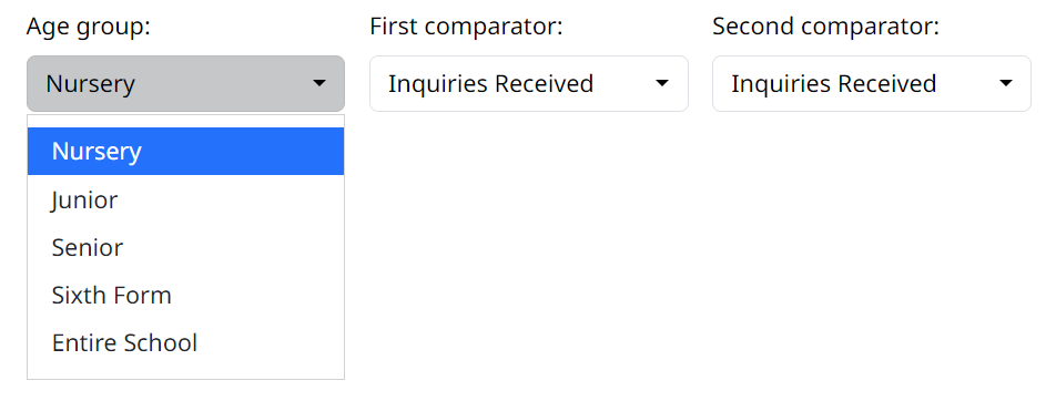
The Age group drop down let’s you choose which age group or the entire school to look at:
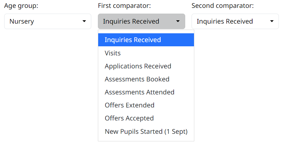
The First and Second comparator let’s you choose two different variables, for which you can the compare the rate.
The rate is calculated as:
\[ Rate = First \space comparator / Second \space comparator \]
The plot then shows the distribution of the selected rate for the benchmark, with your school highlighted along with the mean and median.